Blog Archives
Friday The 13th Hockey Jersey Design
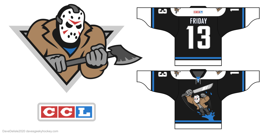
This Jason Voorhees jersey combines a few of my favorite hockey designs: The Calgary Hitmen logo and the Anaheim Mighty Ducks’ Wild Wing jersey from the 90’s. Usually I don’t do horror stuff but Halloween has me in a good mood! Sorry for the lack of blood, just wanted to keep that Disney style intact.
Prince George Cougars Hockey Jersey Design
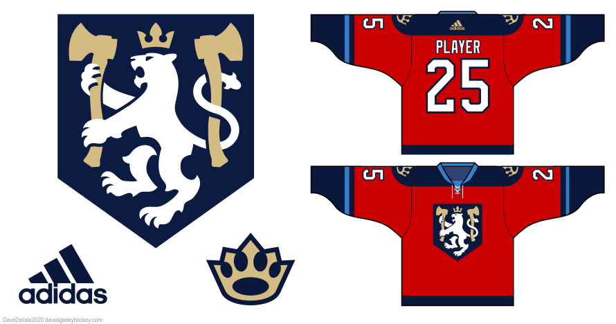
I used to call Prince George home many years ago, and I always felt their WHL team could look a bit more regal to match the city name (I do kinda like their current Thundercats logo). I added a few axes because the city is a forestry hub. The shoulder patch logo mixes a crown and paw together.
The Expanse Hockey Jersey Designs
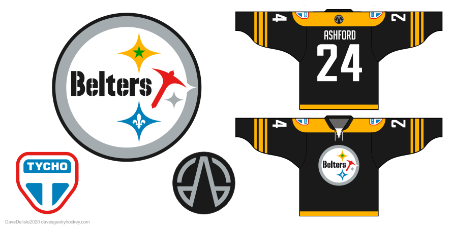
First off is the Belters, which pays homage to their mining of the outer asteroid belt (along with a few nods to their Creole culture). The Pittsburgh Steelers felt like a good fit for this design.
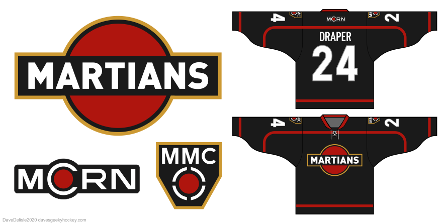
The Martians borrow their main logo from Martini Racing, and the overall design matches their military uniform somewhat. Wish I could fit a vertical silver stripe on the front, it just won’t fit.
No UN design yet, maybe one day. I’ve actually been sitting on these two designs for a few years now, because I felt the factions on the show were becoming less relevant to the story. Sharing them now because why not?
News: I am no longer on any social media! I recommend you subscribe for email alerts if you want to see new designs appear in your inbox, or just bookmark this page and visit every so often.
Stargate SG-1 Hockey Jersey Design
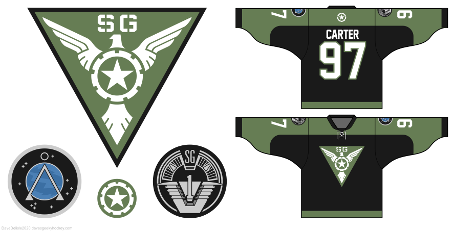
Went with the obvious US Air Force theme here, starting with the main logo (number 13 shown here) which I spruced up with Captain America’s SSR logo. The black body represents the flak jackets worn by the characters on the show. I know it’s simple but I tend to lean towards old-school hockey fashion.
Trekkies Hockey Jersey Design
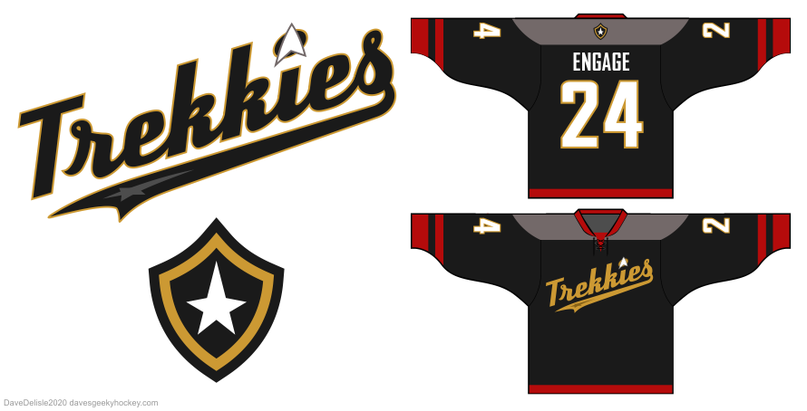
Went with the movie TNG/DS9 uniforms because they look nicer in my opinion, especially with the stripe at the cuffs (the additional stripes represent the crew undershirt). The back patch is based on the LA Galaxy logo, and is placeholder.
Speaking of which, it was a struggle to make secondary patches for this one. I flirted with a bunch of silly logos but they kept ruining the classic look of this design! I am leaving it for now, but if I think of anything I’ll add it in the future.
Spaceballs 3.0 Hockey Jersey Design

Just wanted to add some color to this design, which helps the character on the main logo pop. The back patch is the Skroob medallion which everyone wears as a belt buckle. I debated removing “The Hockey Jersey” for the longest time; it would look cleaner but would it still be Spaceballs? This will haunt me forever.

