Search Results for game of thrones
Game Of Thrones Night’s Watch Hockey Jersey Design

Click To Enlarge
UPDATE: Well I shall revisit the main crest. Consider this design the Beta.
I am still plugging away on the jersey designs for the upcoming Game Of Thrones offer, which will feature the Night’s Watch, Targaryen Dragons, and Stark Direwolves. Both Targaryen 2.0 and Direwolves 4.0 need some touching up, but I thought I’d share the Night’s Watch design.
If you’re not familiar with the books or show, the Night’s Watch do not have a sigil. So I created one that uses a crow – a nickname for the Watch. Went with Rangers as a team name, which felt better suited than having “Night’s Watch” plastered over the main logo. Also Rangers is a familiar team name. Night’s Watch was relegated to a shoulder patch that also features the sword Longclaw.
The jersey had to be predominantly black, no way of getting around that. One design touch I made was making a light grey mid-stripe that also rides high on the arms. This stripe represents the Wall. What can I say? I’m a sucker for symbolism.
This design will be made available soon! Sorry for the delay.
Note: I forgot to change the number from a previous Hunger Games design, which is why it reads as 74. Should read 97 for the old bear.
Share this:

Night’s Watch 2.0 Hockey Jersey Design

It’s been almost 2 years since I last posted a Night’s Watch design! Last time I centered the design around the ‘Rangers’ and featured an impaled White Walker. This time the design is all about the Crows.
Share this:

Buffy The Vampire Slayer Baseball Jersey Design

Ah Spring. It’s now time for one of the greatest traditions known to man: a brand new season of Game of Thrones. Also for a few people out there it’s now the start of “baseball” season.
To celebrate America’s past-time here’s a Buffy The Vampire Slayer baseball jersey design. Yeah it’s a bit gory.
Share this:

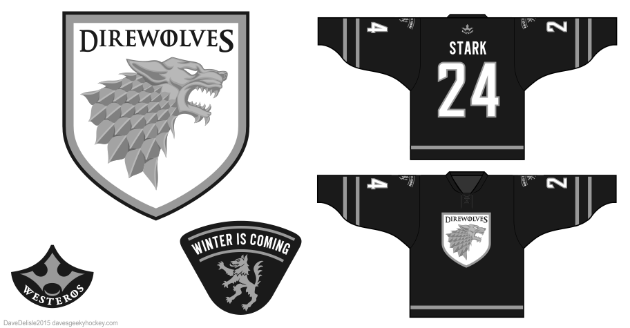
House Stark And House Targaryen Hockey Jerseys

The sixth iteration of the Direwolves jersey is here! Looking back at the 5.0 version you can see quite a few differences in the new design. New primary logo, new shoulder patches, new back patch, new number font, and a return to the classic LA Kings jersey style. The shoulder patches get a “true sigil”, which is a full-body grey Dire Wolf dancing against a white field, along with the house motto.
The new back patch is the league logo, and it features the “You Win Or You Die” slogan. The slogan is intentionally watermarked because A) I didn’t want the design to be too wordy B) it’s something that should be appreciated upon closer inspection, and C) I don’t want schools to ban this jersey! Besides, I want the League name to be the emphasis.

This is the 3rd iteration of the Dragons jersey. I got rid of the grey and opted for a New Jersey Devils look, minus the black shoulder yoke. A new logo and new shoulder patch round out the design. I know I’ve been promising Targaryens for some time, that’s because I’ve had a design done since March — even sent it to Geeky Jerseys. But I wasn’t happy with it and cancelled it. I really like this design, glad I was able to refine it these past few months.
Share this:


Direwolves 7.0 Hockey Jersey Design
Here is the 7th edition of the popular Direwolves design. Geeky Jerseys wanted to do a “silver variant” of the design (like the gold variant for Voltron last year), so I came up with this.
New stripes this time, so hopefully folks who avoided the previous 6 designs because of their LA Kings look will be on board for this one. New shoulder patches and a back patch that is a stylized “W”/crown for Westeros. The back patch is my riff on Adidas, so if we ever did football kits that would be the go-to logo.


