Spaceballs 3.0 Hockey Jersey Design
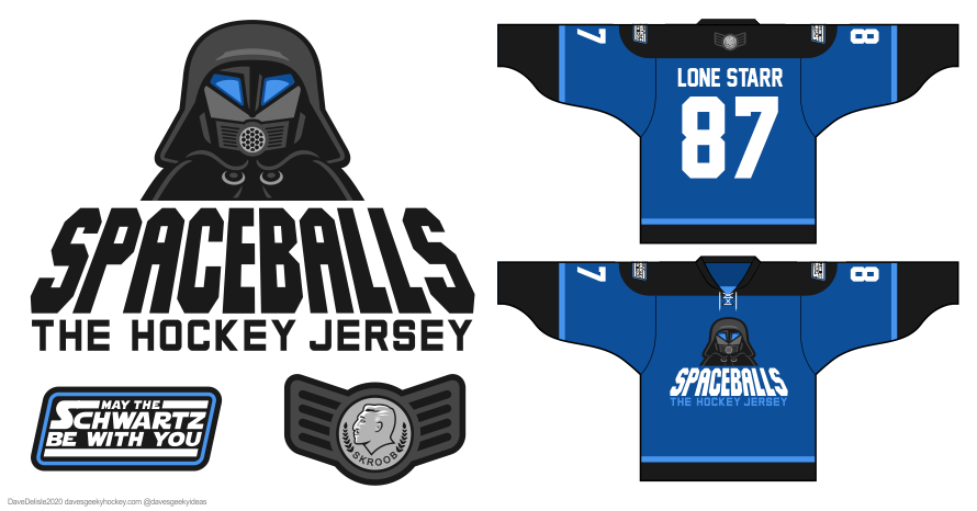
Just wanted to add some color to this design, which helps the character on the main logo pop. The back patch is the Skroob medallion which everyone wears as a belt buckle. I debated removing “The Hockey Jersey” for the longest time; it would look cleaner but would it still be Spaceballs? This will haunt me forever.
Share this:

Posted on March 9, 2020, in Geeky Jerseys, Hockey Jersey Design and tagged Films, Geeky Hockey Jerseys, Hockey Jersey Design, SPACEBALLS. Bookmark the permalink. 2 Comments.


I love the current design, own one and it gets lots of comments when I wear it. I don’t think blue is a good color to use, it wasn’t prevalent in the movie. Maybe a silver color if you want two-tone?
And I love the “Yogurt Athletic” logo on the back of my jersey. That should stay. Perhaps make “Skroob” wings for one of the shoulders opposite “May the Schwartz be with you”?
First, are they big enough to wear over pads? If so, second, take my money! Haha