Busters 4.0 Hockey Jersey Design
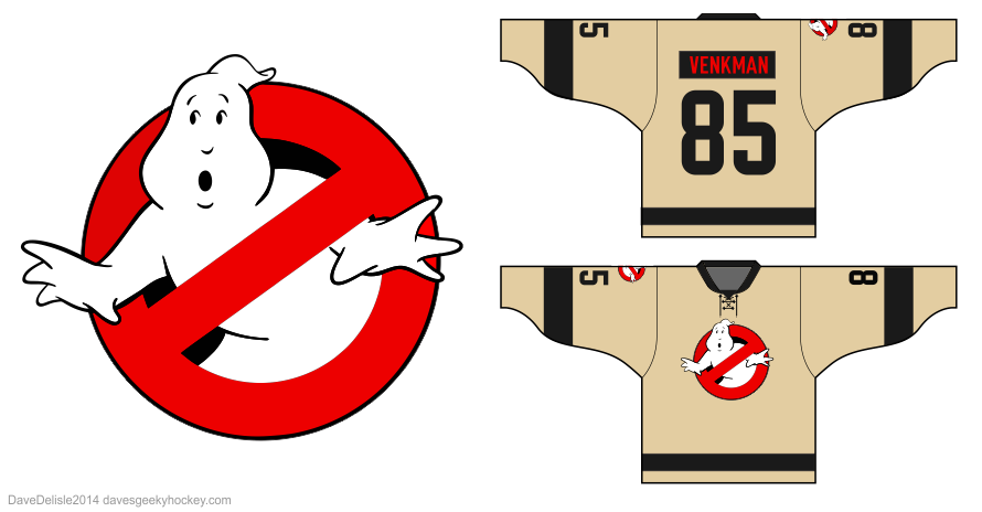
I’m not going to reinvent the wheel here! Thought I’d make the name font skinnier, and the number font a bit similar to the recent Stay Puft jersey. The numbers are also moved off the sleeves so I could add more visual interest to the arms. All numbers are black now.
I’d like to go on record saying I did play around with this design. Stuff like red numbers with black outlines, elbow patches, fake zipper patches, and so on. Ultimately I followed my mantra: keep it simple. After the Link 3.0 experience I felt it best to evolve the design yet remain true to what folks liked before.
Keep an eye on my Now Available page in the coming weeks for news regarding this design.
Share this:

Posted on February 8, 2014, in Geeky Jerseys, Hockey Jersey Design and tagged geeky, Geeky Hockey Jerseys, Ghostbusters, Hockey Jersey Design. Bookmark the permalink. 8 Comments.


Don’t let the haters win! Link 3.0 was ballin’! -Bruce
Is there anyway to still order this?
You missed out on the most recent offer in August. You’ll have to wait until the next opportunity. Sign-up for it at http://www.geekyjerseys.com (the By Demand listing isn’t there right now, I’ll look into it).
So when will the busters 4.0 hockey jersey be available for purchase?
This is fantastic, i need one in my life. Keep doing what you do Dave
let me know if you make this again!
How much? When? Size 56.
Are these gif sale? Where and how much?